In it's simplest form MVT or multivariate testing is where you test alternative experiences of an existing webpage against the current page design or user journey. Unlike AB or Split testing where you test one webpage design against another, in MVT you test a combination of page elements like alternative page copy, headings, images, buttons and so on all at once to see which specific combination of alternative designs work best in driving page visitors or customers towards an end goal of your choosing.
All testing, regardless of whether its an AB or MVT test requires two things. Time and Traffic. By that I mean you need to give a test enough time to establish what's called statistical significance, to basically reach a stable conclusion, and you will also require a volume of website traffic to churn through your test experiences. Typically you need less traffic to run through an AB test which normally only has a couple of alternative page designs to get through. In an MVT test you will typically have a higher number of test combinations to get through and therefore will require enough traffic to 'feed' your test.
In all test situations you continue to send a proportion of traffic to your existing page or default page to benchmark your alternative experiences against it. This is where you are calculationg any uplift in conversion, be that click through rate or the number of people getting to and passing through your check out process.
Testing outcomes can be positive or negative. A positive outcome might be that you test a red check out button versus a blue check out button and the red button delivers 8% more purchases. A negative outcome might be that the same button delivers a -5% drop in purchases. However, either way you have a valuable learning that tells you what changes to make to your site or inform further testing.

The professional blog of Ben Lang a Conversion Rate Optimization practitioner since 2008. Here I share my test results, testing experience & occasionally some thoughts. You can hire my CRO services at benlang.co.uk
Showing posts with label conversion rate optimization. Show all posts
Showing posts with label conversion rate optimization. Show all posts
The Gutenberg rule - revisited
In a previous post about the Gutenberg rule I mentioned that we'd achieved some good AB and MVT testing results using this design principle. The principle basically works off the theory that humans subconsciously scan a print or web page from top left to bottom right and then loop back up the page. So allowing this principle to manage your page layout seems to have become the norm in web design placing buttons and other key calls to action in the 'fertile' areas, typically bottom right.
Increasingly though I notice that more and more people are breaking from this practice whether through test learnings or just asthetic decisions. An example being Aviva.co.uk .As you can see below their landing page for car insurance aligns much of it's content to the left of the page. Having become comfortable with placing the onward journey point at the bottom right this just jars. Having said that it's important to challenge the norms to see what resonates with the customer. I may have to test this layout myself to check we're not missing a trick.


Happy testing : )
Increasingly though I notice that more and more people are breaking from this practice whether through test learnings or just asthetic decisions. An example being Aviva.co.uk .As you can see below their landing page for car insurance aligns much of it's content to the left of the page. Having become comfortable with placing the onward journey point at the bottom right this just jars. Having said that it's important to challenge the norms to see what resonates with the customer. I may have to test this layout myself to check we're not missing a trick.
In the meantime here's a mock-up of an alternative design I would test based on established findings.


Page fold - browser size tool revisited
Problem: Recently Google have moved their Browser Size Tool into Google Analytics. For me and many other sites this means it simply no longer works as the 'In-page' reporting showing heatmaps and so on doesn't work or execute with our lovely CMS.Boo!
Solution: There's a free alternative. Yay! Called whereisthefold.com.
This is what it looks like on this blog.

Solution: There's a free alternative. Yay! Called whereisthefold.com.
This is what it looks like on this blog.
a/b testing tools comparison by popularity

It's also interesting to see so many new companies and start-ups there are in the CRO business since I last did this audit back in 2010 and also how many providers are no longer around. It's a fierce and competitive business....
So here's what I've found as at August 2014. Sources: Alexa.com, Google Adwords and Own Vendor sites
updated 13th Oct 2014
| Reach ranking | Vendor | Alexa volumes YTD | Avg. monthly searches for product | No. of publically listed clients |
| 1 | SiteSpect | 381,175 | 98,600 | 55 |
| 2 | adlucent | 324,719 | 27,000 | 0 |
| 3 | Google Experiments | 10,806,000 | 802,000 | 0 |
| 4 | Conversion multiplier | 3,987,218 | 73,600 | 0 |
| 5 | Global Maxer | 3,210,851 | 51,000 | 0 |
| 6 | Conductrics | 2,333,087 | 14,700 | 0 |
| 7 | Qubit | 1,506,519 | 25,880 | 131 |
| 8 | Avenso | 1,020,946 | 1,030 | 32 |
| 9 | Clickthroo | 974,000 | 47,819 | 0 |
| 10 | Adobe Test and Target | 945,671 | 78,000 | 0 |
| 11 | Visual Website Optimizer | 908,000 | 13,102 | 0 |
| 12 | Accenture | 860,000 | 13,240 | 0 |
| 13 | Webtrends | 763,000 | 19,600 | 0 |
| 14 | Hi Conversion | 722,004 | 47,000 | 44 |
| 15 | Get Smart Content | 673,173 | 3,740 | 14 |
| 16 | Convert | 672,000 | 126,000 | 0 |
| 17 | Taplytics | 283,016 | 12,789 | 6 |
| 18 | Optimizely | 239,000 | 58,898 | 25 |
| 19 | Maxymiser | 149,697 | 6,980 | 78 |
| 20 | Site Tuners | 121,678 | 13,000 | 72 |
| 21 | Autonomy | 120,271 | 26,000 | 0 |
| 22 | AB Tasty | 93,689 | 27,000 | 31 |
| 23 | Monetate | 36,501 | 21,230 | 39 |
| 24 | Unbounce | 22,230 | 12,230 | 0 |
| 25 | Hubspot | 2,700 | 541 | 0 |
| 26 | Genetify | 0 | 6,830 | 0 |
| 27 | Vanity | 0 | 6,400 | 0 |
Happy testing : )
What's the process for deciding what to test?
I constantly have to remind myself of the process I should go through in identifying what I need to test, the best use of testing resource and how to get buy in. To this end I've done a mildly influenced by Mad Men presentation here:

The ethics & morality of A/B testing - #FacebookExperiment

Google Analytics Intraday reporting
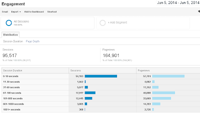
Here's a tip if you, like me need to get an intraday view of traffic volumes on your website. In the current version of GA go to Reporting |Audience | Engagement and select the current day from the calender. This report will give you your traffic volumes for the current day. If you need to see realtime volumes you can of course view the Realtime section of GA.

Throwing baby out with the bath water. Website redesign.

The Optimisation landscape has changed. Have you kept up?
 A number of things have changed in the world of MVT testing, AB testing and Conversion Rate Optimization (CRO) generally over the last few years. The question we have to ask of ourselves and the people we work with is whether we have truly kept pace with these changes. I've asked this question a lot recently and a number of areas have been found wanting.
1. The economic collapse of 2008 changed everything both in terms of the economy but also the web, how eCommerce businesses either thrived or died. The reduction of cash flow in internet businesses both drove the argument for testing and improving your online experience to squeeze the very last drop of our traffic and it also threw greater intensity on the need to prove ROI . If CRO was ever seen as peripheral then this was the time to prove your worth and justify the ongoing investment as a core player in the online channel not waiting in the wings. Verdict: Done OK. Could do better.
2. Web traffic has radically shifted into different segments. The Mobile and Tablet device accounts for around 30% of web traffic at the moment and continues to rise. As a consequence traditional fixed web testing is becoming less and less relevant as each day passes. If you're not actively testing in these new segments now it may already be too late. Despite some early and ongoing dabbling in these emerging segments we have failed to make any real inroads in terms of replicating the successes achieved in desktop testing. Verdict: Strong start but faded fast.
3. Are still looking at the same things to test time and again? Sometimes you need to retest the same concepts and experiences especially those user journeys core to your sales and service funnel but sometimes you need a fresh pair of eyes on your business to get new insight and ideas. Verdict: Good but room for improvement.
4. Your choice of testing vendor is still key. The things you look for in a testing partner are those that can help address the shortcomings mentioned above. Someone who does enable testing in those emerging segments, who continually helps evidence ROI for your CRO activity to the budget holders, and someone who is proactive and brings fresh ideas and insight to the table. More importantly now you need someone who wants to be embedded in your business and add value day in day out and doesn't get complacent. Verdict: TBC
I firmly believe that MVT and CRO can still offer huge uptick in web performance for the online player. I guess the biggest danger is falling into patterns of working and thinking that worked well in the past but don't necessarily work as well today. Continual self assessment and re-evaluation of all the components in your testing programme should still yield success but you might have to make some tough decisions and change to bring about renewed success.
Here's a few things I've discovered through a LOT of testing
These are some of the findings I've discovered through many years of testing in a bid to retain this valuable knowledge and avoid past mistakes, I'm sharing them with you now. You're welcome : )
Some key testing findings.....
1. Place Call-to-Action on bottom right. Always.
2. What are the 3 main features/benefits – ‘unique value proposition? Now are they immediately obvious on your page? No? Put them there.
3. Do you have credibility indicators for your website; testimonials, reviews, awards, stats? Use them. Ideally as secondary content. By that I mean placed in content that isn't a lead up to your main Call To Action but in content below or to the side of it.
4. If you can drive people to a product page instead of a hub/portfolio page, do it.
5. Avoid additional links on your page. Generally speaking these are just leakage points. Customers will use them given the opportunity.
6. Strongly differentiate between products where they are jointly visible on the same page.
7. Is your copy generating any fear? If you have to throw up a negative messages relating to your product such as "this *** if used incorrectly will kill you" consider the tone of voice in which you do it.
8. We’re not selling features, we’re selling solutions to customer problems. Need led propositions works. Always.
9. White space can be used to make a page look less ominous. Too much and it makes it look amateurish.Get an eye for balance.
10. Too much of one colour on a page leads to information blindness. Avoid the Sea of Red/black/yellow.
11. Anything that rotates or animates tends to draw focus to your static secondary content. Place your proposition in the static content.
12. Ensure continuity of look & feel in the journey. You’ll increase drop-out if you ask a customer to go through multiple brand look & feel experiences. Continuity and flow.
13. Your existing customers are considerably more likely to buy from you than new customers. Differentiate between the two segments whenever possible. Use a sense of loyalty.
14. Remove choices. Yes you should always support multichannel but be aware if you offer a CTA to offline channels you are generally loosening your online sales funnel.
15. Understand where the visitor came from. If you said something in a PPC Ad make sure it’s reiterated in your page front & centre. If they came from a Partner/Aggregator they are a ‘hotter’ lead and need reassurance that you’re up to the job of giving them a solution to their ‘need’.
16. People don't read on the Web. Study after study has shown that less content on a landing page leads to higher conversion rates. Ruthlessly edit your text down to simple headlines and short, bulleted lists. Cut out the self-promoting marketing speak that people won't read anyway. You can link to detailed information on supporting pages.
17. Despite what many people say there IS a page fold. Be aware of it and if it’s crucial to the user journey and the value proposition it SHOULD be above the page fold.
NEVER SECOND GUESS THE CUSTOMER. TEST MULTIPLE EXPERIENCES & THEORIES. LET THE PUBLIC DECIDE WHAT WORKS.
Happy testing : )
Letting go
The human capacity for subjective or indeed plain sentiment in web design is fascinating. As optimisation specialists we testers or CRO experts hold little stock by either of these two concepts and have sacrificed both these a longtime ago in favour of asking the general population what web experience works best. And yet you can conduct some quite clinical testing on the value of a specific web design or element and put hard facts & figures behind its actual value in the user journey but still be told THAT widget or page design is staying because the product team wanted & designed it. Classic case & point this week in my world of testing. We have a web page where the primary call to action is a savings calculator. Some indepth analysis showed that visitors who engaged with this widget converted at just 1%. Conversly visitors who didn't engage with the calculator converted at a staggering 12% by comparison. MVT testing backed this up conclusively. This calculator deserved no place in the sales funnel. Presented with the hard, black & white facts the stakeholder was intent on retaining this ill conceived widget because it was the baby of person X and cost £££££ to build. In conclusion, sometimes you can never win out with testing. Sometimes subjectivity & sentiment wins despite evidence to the contrary. Sometimes either the client or you need to learn to let go. Be strong. Happy testing : )
The vanity of paying for web analytics tools
If it's not obvious then let me come out and say it for the record. I am a massive fan of Google Analtics.
 These are usually the very reasons I hate alternative solutions because they are either lacking in one or all four. You pay stupid $$$ annually for a huge, clunky solution that was probably cutting edge 5 years ago but has languished since in the R&D field for as many years. Tagging will take forever and will be a hateful, hateful experience requiring enormous and valuable IT resource to implement. You'll eventually get it up and running but then realise that one of the key metrics is missing from your dashboard. An early evening call to Seattle will get you talking to the vendor support team who will make it clear that the sales team shouldn't have told you that THAT metric was a feature of your shiny new analytics package. Etc, etc.
I love this tool for so many reasons. Here's my top 4:
- It's always improving, new features added almost on a quarterly basis
- It has almost everything you could possibly need as a professional web analyst
- It's easy to implement. Tagging is straight forward and it's hard to get it wrong.
- It's FREE
 These are usually the very reasons I hate alternative solutions because they are either lacking in one or all four. You pay stupid $$$ annually for a huge, clunky solution that was probably cutting edge 5 years ago but has languished since in the R&D field for as many years. Tagging will take forever and will be a hateful, hateful experience requiring enormous and valuable IT resource to implement. You'll eventually get it up and running but then realise that one of the key metrics is missing from your dashboard. An early evening call to Seattle will get you talking to the vendor support team who will make it clear that the sales team shouldn't have told you that THAT metric was a feature of your shiny new analytics package. Etc, etc.
To put some qualification to this I can talk from experience of using or evaluating some of the key players in this market who I wont mention or embarrass here but if you're in the states it's odds on favourite your corporation is or has used one of the worst culprits out there.
Which leads me on to my issue of paying for off the shelf web analytics.
Right now the key people in organisations feel a sense of paranoia that if they aren't paying some vendor $$$$ periodically for a high end solution which they will probably only be using 10% capacity of on a regular basis they are somehow doing their Digital strategy a disservice. They feel they are somehow not up with the competition. This is nonsense. If you or your analytics team cant get the meat and veg data they need to get meaningful insight into your online customer experience they should probably take a long hard look at themselves and stop blaming their tools : ) Go ahead, pay that £90K per annum for your 24/7 dedicated management contract, with it's Implementation Specialist and certified Partner support, but don't get caught with your pants down when GA launches it's latest Gizmo, Real-time reporting featurette and you deleted those GA tags from your site 2 months ago because your company didn't want to be seen using a free solution as your primary web data provider.
Happy testing : )
Happy testing : )
Maxymisers Visual Campaign Builder (VCB) test tool
Updated: 19th August 2014.
If you've been using Maxymiser for your MVT testing in the past you may already appreciate this very competent testing tool. Recently the Maxymiser team have developed a new feature that I've been very keen to get my hands on, their Visual Campaign Builder, aka, VCB.
What is it?
Well essentially it's a way to build and launch your own tests very quickly using the MaxTest solution (and leverage the MaxSegment solution too if you have that) using a WYSIWYG on page wizard. You navigate to the test page, create a new test campaign, create new variants, drag and drop assets, change copy and content, assign an existing Action for action tracking and then publish it.
I've trailed two tests to date, one where I'm introducing a new banner to a page and another where I've embedded a YouTube video. Reporting is exactly the same as conventional testing whereby you log into the Maxymiser report console.
Where is it?
Log into the Maxymiser console and navigate to the Campaigns page, you will see a button for the VCB in top right side...

Once it's enabled for your site, when you click the VCB link it should the option to create or edit an existing campaign...

And how do I use it?
Well you should of course get the Maxymiser team to talk you through the first couple of set ups for VCB testing but here's the easy process in summary...

1. Create Campaign.
2. Give it a name.
3. Choose Audience. Here you can target visitors by device, browser, geography, behavior or just choose to test with all visitors.
4. Select the Page(s) you wish to test on by page URL. Cut & Paste the URL into the the URL box provided and add to campaign. At this point you may want to 'Include any query string parameters' or 'Include both HTTP and HTTPS protocols'
5. The next step is the Content creation step for your test. Here you can either add or remove content or create alternative experiences for your test variants. Tip: This is the tricky part of the whole endeavor and I strongly recommend you test how your variants are looking in all browsers and devices you wish to test against.
6. Next step is to select the Actions. Give it a primary action from your drop-down. If you don't have an appropriate action to track on your test you will need to speak to Maxymiser. This can be a stumbling block for getting a test straight out there but if you've got a suite of test actions you've used before there's potential to re-purpose those for a VCB test as long as it doesn't conflict with any other tests you may be running at the same time.
7. Review & Publish. From here you're more or less going through the normal test publishing process, for example, adding change comments and going via the publishing console to send your test live. Tip: You may get a warning about new pages being mapped and might take an empty publish first before you can publish your VCB test.
That is it in it's simplest form.
Good luck and happy testing : )
If you've been using Maxymiser for your MVT testing in the past you may already appreciate this very competent testing tool. Recently the Maxymiser team have developed a new feature that I've been very keen to get my hands on, their Visual Campaign Builder, aka, VCB.
What is it?
Well essentially it's a way to build and launch your own tests very quickly using the MaxTest solution (and leverage the MaxSegment solution too if you have that) using a WYSIWYG on page wizard. You navigate to the test page, create a new test campaign, create new variants, drag and drop assets, change copy and content, assign an existing Action for action tracking and then publish it.
I've trailed two tests to date, one where I'm introducing a new banner to a page and another where I've embedded a YouTube video. Reporting is exactly the same as conventional testing whereby you log into the Maxymiser report console.
Where is it?
Log into the Maxymiser console and navigate to the Campaigns page, you will see a button for the VCB in top right side...

Once it's enabled for your site, when you click the VCB link it should the option to create or edit an existing campaign...

And how do I use it?
Well you should of course get the Maxymiser team to talk you through the first couple of set ups for VCB testing but here's the easy process in summary...
1. Create Campaign.

2. Give it a name.
3. Choose Audience. Here you can target visitors by device, browser, geography, behavior or just choose to test with all visitors.
4. Select the Page(s) you wish to test on by page URL. Cut & Paste the URL into the the URL box provided and add to campaign. At this point you may want to 'Include any query string parameters' or 'Include both HTTP and HTTPS protocols'
5. The next step is the Content creation step for your test. Here you can either add or remove content or create alternative experiences for your test variants. Tip: This is the tricky part of the whole endeavor and I strongly recommend you test how your variants are looking in all browsers and devices you wish to test against.
6. Next step is to select the Actions. Give it a primary action from your drop-down. If you don't have an appropriate action to track on your test you will need to speak to Maxymiser. This can be a stumbling block for getting a test straight out there but if you've got a suite of test actions you've used before there's potential to re-purpose those for a VCB test as long as it doesn't conflict with any other tests you may be running at the same time.
7. Review & Publish. From here you're more or less going through the normal test publishing process, for example, adding change comments and going via the publishing console to send your test live. Tip: You may get a warning about new pages being mapped and might take an empty publish first before you can publish your VCB test.
That is it in it's simplest form.
Good luck and happy testing : )
Click To Call testing
Consious I havn't posted for a bit. Apologies for my tardiness, just busy with the day job : )
 Dead quick summary of our first dedicated smartphone app MVT test using Maxymiser. We were introducing a 0330 phone number on the app for the first time. In the UK this meant that it was actually not too expensive to use your mobile phone to contact our call centre. We wanted to get the best possible call to action for the click to call button from the outset. So we engaged the testing team and we tested several competing button designs and discovered that a nice green button that closely mimicked the native call button of a smartphone produced the highest click/call volumes. This acheived a 16%+ uplift in fact over competing designs. The take away from this I guess is that familiarity drives positie behaviour.
 Dead quick summary of our first dedicated smartphone app MVT test using Maxymiser. We were introducing a 0330 phone number on the app for the first time. In the UK this meant that it was actually not too expensive to use your mobile phone to contact our call centre. We wanted to get the best possible call to action for the click to call button from the outset. So we engaged the testing team and we tested several competing button designs and discovered that a nice green button that closely mimicked the native call button of a smartphone produced the highest click/call volumes. This acheived a 16%+ uplift in fact over competing designs. The take away from this I guess is that familiarity drives positie behaviour.
Unequal visits in Google Experiments
Having run my new Google Experiment for a couple of weeks I have noticed that the distribution of traffic between the default and test page has become hugely unequal.
After a bit of trawling around the web I discovered that this was most likely caused by Google applying a Multi-armed bandit test approach (here)
Google states "a multi-armed bandit is a type of experiment where:
the goal is to find the best, or most profitable action, and
you learn about payoff probabilities as the experiment progresses."
"Once per day, we take a fresh look at your experiment to see how each of the variations has performed, and we adjust the fraction of traffic that each variation will receive going forward. A variation that appears to be doing well gets more traffic, and a variation that is clearly under performing get less."
So essentially Google are no longer retaining an equal traffic share for each variation in the test. If a variation is perceived to be doing worse than another or the default it gets less number of visitors. Equally if a test variant is doing better than another variant or the default it gets a greater share of the traffic. This is fine and will be rewarding for people who want a quick win during experiementation time but it's harder to swallow for those that have been doing conventional A/B or MVT testing up until now. In the past Google have let you adjust test weighting manually and it would be good to offer an overide option whereby the Multi Arm Bandit approach can be disabled by those who want clarity of their tests.
After a bit of trawling around the web I discovered that this was most likely caused by Google applying a Multi-armed bandit test approach (here)
Google states "a multi-armed bandit is a type of experiment where:
the goal is to find the best, or most profitable action, and
you learn about payoff probabilities as the experiment progresses."
"Once per day, we take a fresh look at your experiment to see how each of the variations has performed, and we adjust the fraction of traffic that each variation will receive going forward. A variation that appears to be doing well gets more traffic, and a variation that is clearly under performing get less."
So essentially Google are no longer retaining an equal traffic share for each variation in the test. If a variation is perceived to be doing worse than another or the default it gets less number of visitors. Equally if a test variant is doing better than another variant or the default it gets a greater share of the traffic. This is fine and will be rewarding for people who want a quick win during experiementation time but it's harder to swallow for those that have been doing conventional A/B or MVT testing up until now. In the past Google have let you adjust test weighting manually and it would be good to offer an overide option whereby the Multi Arm Bandit approach can be disabled by those who want clarity of their tests.
Google Content Experiments
Google has announced its moving away from Google Website Optimizer to 'Content Experiments'. This effectively means Optimizer has been fully integrated into the new version of Google Analytics. There are as ever positives & negatives involved. First off it means less coding to be uploaded to your test pages. Great. On the downside tests are now wholley driven around Google Goals. In the past I've found setting up goals to be hard work and they dont always work so coupling testing to goals fills me with concern. Finally I think Google have missed a trick. I think they had an opportunity to make their testing tool a 'tagless solution' under this approach. If they worked in a bit of dynamic javascript into their normal analytics tags you would never have to upload test code for each new experiment. This would greatly increase peoples abilities to conduct testing without further IT input, essentially the holy grail of professional testers. I'm just lining up my 1st test under this regime, I'll you know how it goes.
1st iPhone MVT test. So proud...
Had to share this because, well frankly it was a ball ache & also there is little if not naff all documented on the internet about this (at time of writing). Basically today I managed to get Google Optimizer (now branded as Google Experiments) to work for MVT testing on an iPhone landing page and also circumvent all the issues that go with coding GWO tests on a HTML & jQuery page. The test page in question is here:
Essentially it's very hard to do conventional MVT testing on mobile pages as the use of jQuery etc can really complicate straightforward test building & coding. My tip is to knock out all jQuery references such as 'data-role' and make inline requests to restore your CSS. I may add further detail in a later post but this mobile testing is in its infancy as far as my experience is concerned.

Essentially it's very hard to do conventional MVT testing on mobile pages as the use of jQuery etc can really complicate straightforward test building & coding. My tip is to knock out all jQuery references such as 'data-role' and make inline requests to restore your CSS. I may add further detail in a later post but this mobile testing is in its infancy as far as my experience is concerned.
Google Analytics Real-time
Well I have to say I've been blown away today by a very slick new function in GA. Real-time (beta) gives you live visitor data for your website. Essentially It gives you live unique visitor volumes, page views, popular pages, top referrers, keywords and geolocation, oh and device breakdown. ITS BRILLIANT! It gives you the last 30 minutes of activity and leaves you wanting the data gap filled between Real-time and your standard reports with their 24 hr lag! It's also very addictive. I've just been watching activity on our main site for the last couple of hours. It's held firm with circa 4.5k visitors at any one moment only for Eastenders to come on telly and instantly see the figures drop to around 500, mainly in the South East : )
Real-time has actually been around since autumn 2011, but available only to the chosen few. I've overlooked it's existence purely because like many I've hated the new version of GA, or the interface at least and have continually flicked back to the old version where this feature is not available. Have to say I will be revising my view of the new version given this little gem of a feature. To get to the report click on the 'home' tab in GA (new) and it's the top link on the left hand nav. Works super fast in Chrome but slower in other browsers. Enjoy!

Real-time has actually been around since autumn 2011, but available only to the chosen few. I've overlooked it's existence purely because like many I've hated the new version of GA, or the interface at least and have continually flicked back to the old version where this feature is not available. Have to say I will be revising my view of the new version given this little gem of a feature. To get to the report click on the 'home' tab in GA (new) and it's the top link on the left hand nav. Works super fast in Chrome but slower in other browsers. Enjoy!
First mobile landing page test
I launched a Google Otimizer Ab test at the start of the week to see if I could drive an uplift in Mobile Banking registrations. Essentially the newly launched landing page for mobile banking had a CTA for the registration form but it was available on only the last tab of a 4 tab page design. Using GWO I added the same CTA to the footer of the page so that it was available across all tabs. Within just a few days the new design was beating the old design hands down with a +200% uplift in people clicking through to the registration form with a 99% confidence index. I'll add an image of the design soon. Update: the design has sustained it's uplift 3 weeks on. We now have a 10.5% conversion versus 1.5% for the old design.

Popular posts
Thought I'd compile a list of the most popular posts on this blog based upon web stats to date:
1. Is FatWire any good?
2. Culling multivariate test variants
3. The Gutenburg Rule
4. Above the fold - The Google Browser size tool
5. How do you calculate uplift in a multivariate test?
6. Review of Google Website Optimizer
7. The Law of diminishing returns in testing.
8. Riding the tsunami - testing during a traffic spike.
9. Short wave MVT testing.
10. An offline call to action.
1. Is FatWire any good?
2. Culling multivariate test variants
3. The Gutenburg Rule
4. Above the fold - The Google Browser size tool
5. How do you calculate uplift in a multivariate test?
6. Review of Google Website Optimizer
7. The Law of diminishing returns in testing.
8. Riding the tsunami - testing during a traffic spike.
9. Short wave MVT testing.
10. An offline call to action.
Subscribe to:
Posts (Atom)